Typographic Manifesto
This manifesto was created in response to the 2017 International Society of Type Designers Typographic Project Brief 4, "Where is here?" I created a manifesto that answered that question, and my answer was "everywhere."
I received a score of Merit.


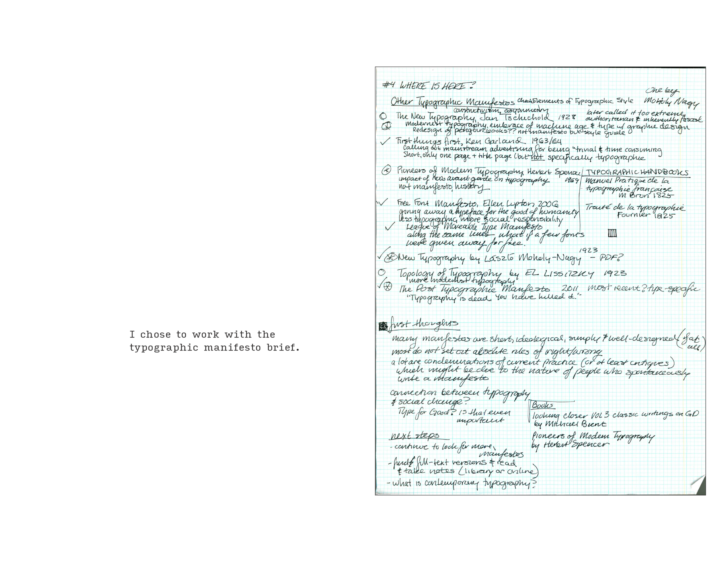
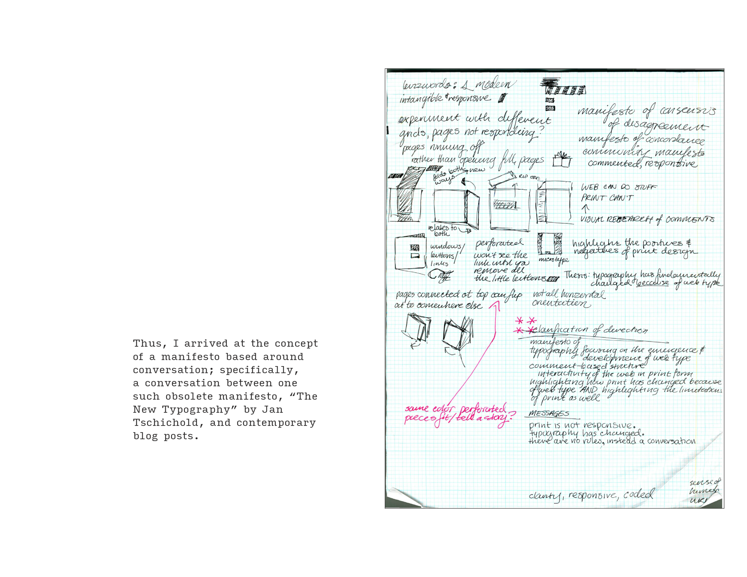
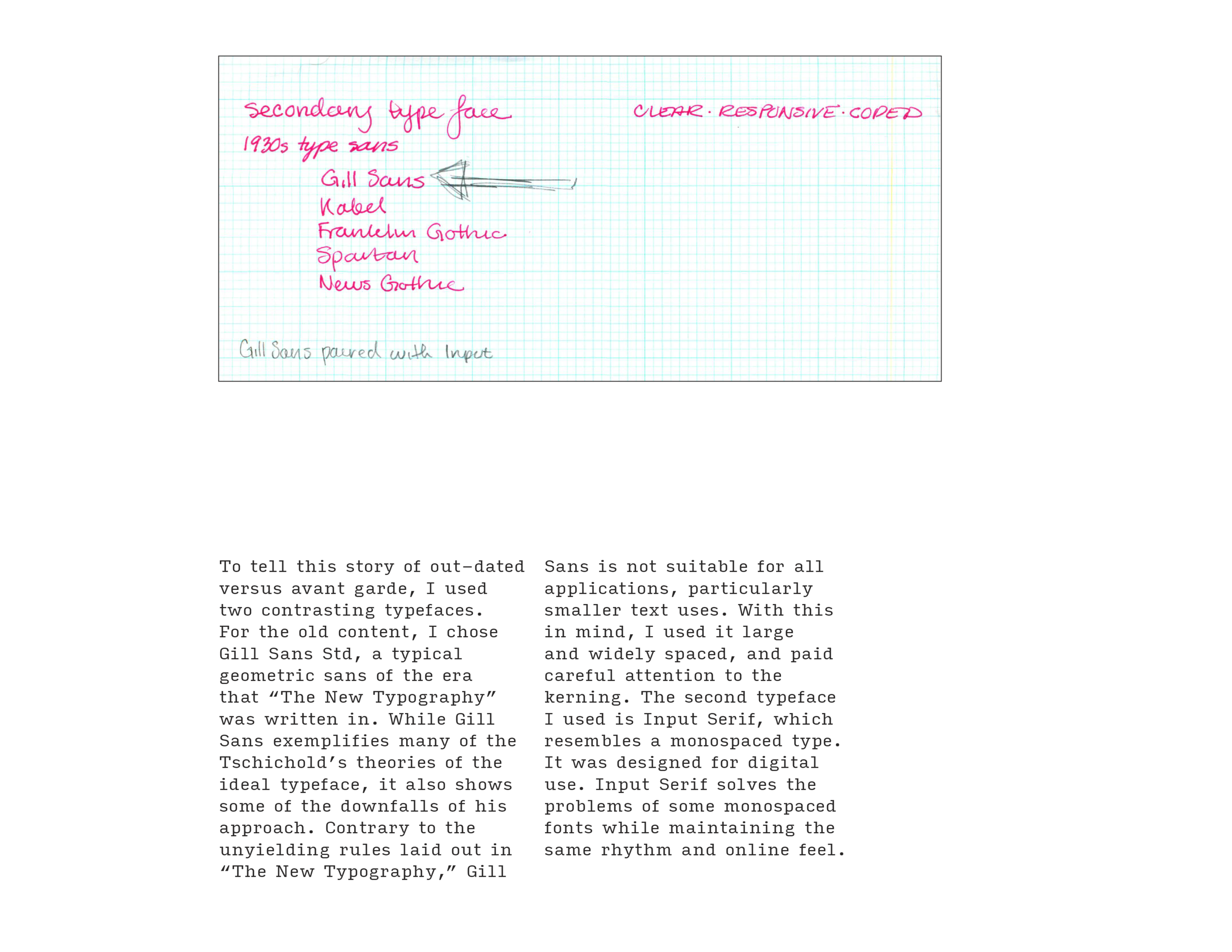
Through a rigorous research process, detailed above, I arrived at a color palette and typography scheme.
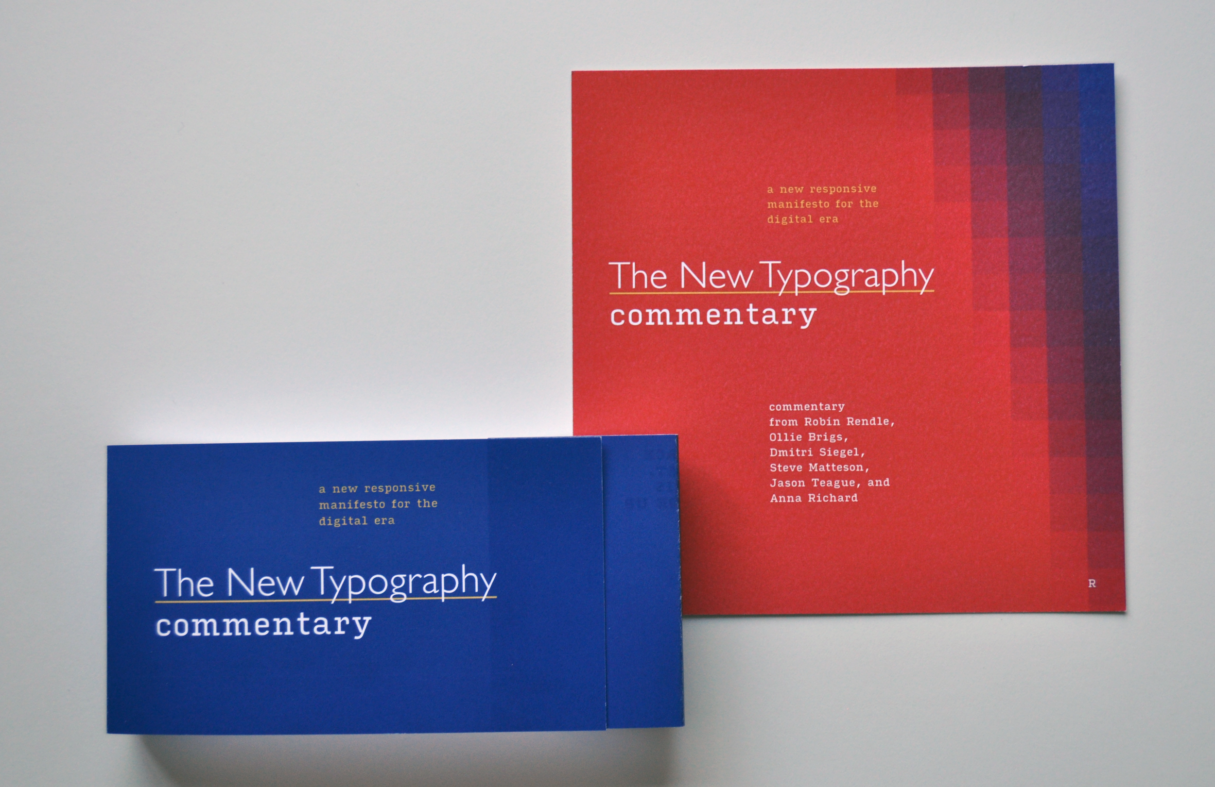
I used RGB colors that would never appear in print as they do on screen to highlight the differences between print and web as mediums. The colors pop in images and in the original designs, but appear more subdued in print.
Similarly, the two typefaces I chose are specialized as well. Gill Sans is a notoriously finicky geometric sans, the kind that Jan Tschichold was very fond of. It works printed, but isn't well-suited to web typography. The other typeface, Input Serif, was designed for computer programming work with its printed form not being part of the design process.


To illustrate the concept of constructed knowledge in a different way, I put a summary of the statements made in my manifesto on the backs of the cards, as a puzzle. The words could only be read when assembled in the correct order.


As part of the submission process, I created clear cards, one inch wider, that detailed the typographic treatments throughout the book. One card also shows the square grid I used to lay out the book. Those typographic specifications are shown below.


